

My Role
Product Designer 2— Product Strategy, User Flows, Prototyping, Visual Design
Team
Priyank Mehta, POD Lead
Prakash Singh, PM
Manas Mohapatra, SDE
Jitendra Kumar, SDE
Rajvi Dave, QA
Duration
Jan 2024 - Feb 2024
Overview
Community 2.0 was launched with a bang - a much needed upgrade for the community 1.0.
Along with institutionalising the events/ sessions from our old community, we even launched new events, onboarded new creators & even promoted some of old power users for our partner program.
Thus, this project talks about how we created a personalised dashboard for our partner program creators that could help them in their content management.
The Backstory — How this all started?
Managing content & strategy for 5M+ users on community 1.0 is a team effort. Along with driving content, we also encouraged young skillful users in content creation & knowledge sharing through our meetups, online live sessions & QnAs.
As a result of which, we saw a pattern when organic user-generated posts (sharing knowledge & every day experiences) increased from 3.2% to 7.6%:
We felt there were more opinion makers in the community.
Out of those 7.6%:
43% posts were from power users
42% posts were from first-time users
14% posts were spam
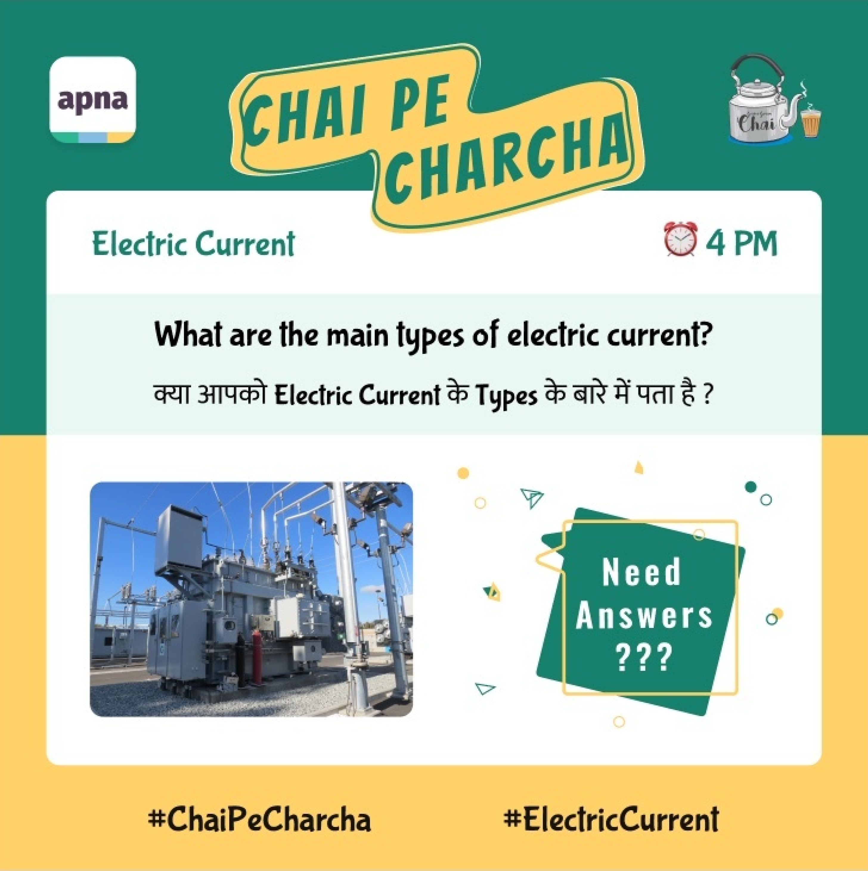
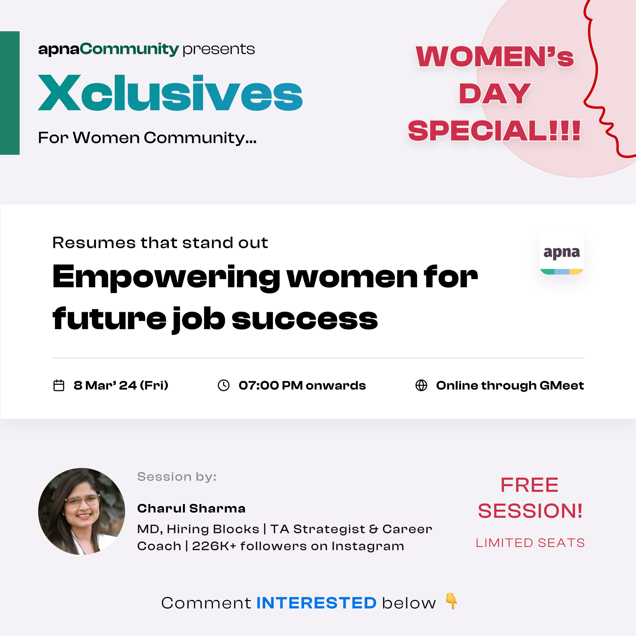
We wanted to streamline this positive change.Thus, we gave our community 1.0 a much needed upgrade - with QnAs - 'Chai pe Charcha', Live learning sessions - 'Xclusives Talk', verifying old creators creators & onboarding new ones. Glimpses of the posters for the above events:


Since more & more creators were getting onboarded, assigning a dedicated PoC for each one of them was difficult. Real time data reporting & analysis, self creation of posts etc. was resisting new creators to post content actively. Thus, we eventually decided to build a dedicated dashboard exclusively for creators & group admins for them to manage their content easily.
We needed a platform… but for 2 different personas !
2 different personas meant - the ask is same but the requirement would differ:
Persona 1: Well-known professional creators from other platforms who were invited to collaborate in the newly launched 'Creator Partner Program'
Persona 2: Power users from the old community were now promoted & given an added responsibility of managing the open group of their skill.
This is when we deep dived to know more about both of the stakeholders, their needs, their likes/ dislikes to prioritise our design decisions.
Persona 1: Well-known professional creators


About them:
Popular on professional platforms like LinkedIn, Instagram
Often conduct skill-based trainings & courses
Mostly uses laptops for content creation
Their usage in community 2.0:
They'd be given a semi-broadcast group to manage.
They could use that group to promote their content & promotions.
Want to be active in their individual groups only without bothering on other groups.
Their needs:
Desktop-first platform to manage their content & group
Wanted it to be simple & straight-forward
Persona 2: Power Users/ Group Admins

About them:
Consists of students or freshers who recently started with jobs
Learning new skills, craving to get popular & mostly inspired by the creators on Insta reels/ YT shorts
Mostly uses mobile for content creation
Their usage in community 2.0:
They'd be allotted an open group to manage.
Had double responsibility - as a general user + as a group admin.
They needed to consume community's overall content as well
Their needs:
Mobile-first platform to manage their content & group
Wanted an easy way to see group-only notif. for any updates
The real challenge - whom should we design if for first…?
The no. of posts created by Power Users (PU) were 10x times higher. For every post by Partner Creators (PC), a power user can create 10 posts. Also, every 1/4th post of Partner Creators is likely to get 20K+ views than the 3K - 5K+ views from PU.

The closed groups of the PC was such that only they can create a post (a semi-broadcast group). Thus, to create a post, PC had to maintain an excel for their posts & share it with their PoC. For last moment changes, mailing the changes was practically difficult. Averaging it out, posting a post took around 1 - 2 hours (excluding the post writing time).

At the same time, the PU by the virtue of their open group, where everyone was allowed to post, can create a post in max 15 -20 mins through the Apna app. In case, they were managing more than 1 groups, they just had to switch b/w profiles.
Thus, seeing the consistent views/ engagement ratio + more quality posts of Partner Creators we decided to divide the task into 2 phases:
Phase 1: Creating a web dashboard for PC (90% creators used laptops, until small tweets/ Insta status)
Phase 2: Creating a creator mode flows for Power Users & integrating it with the current Apna app
Phase 1 begins
Objective:
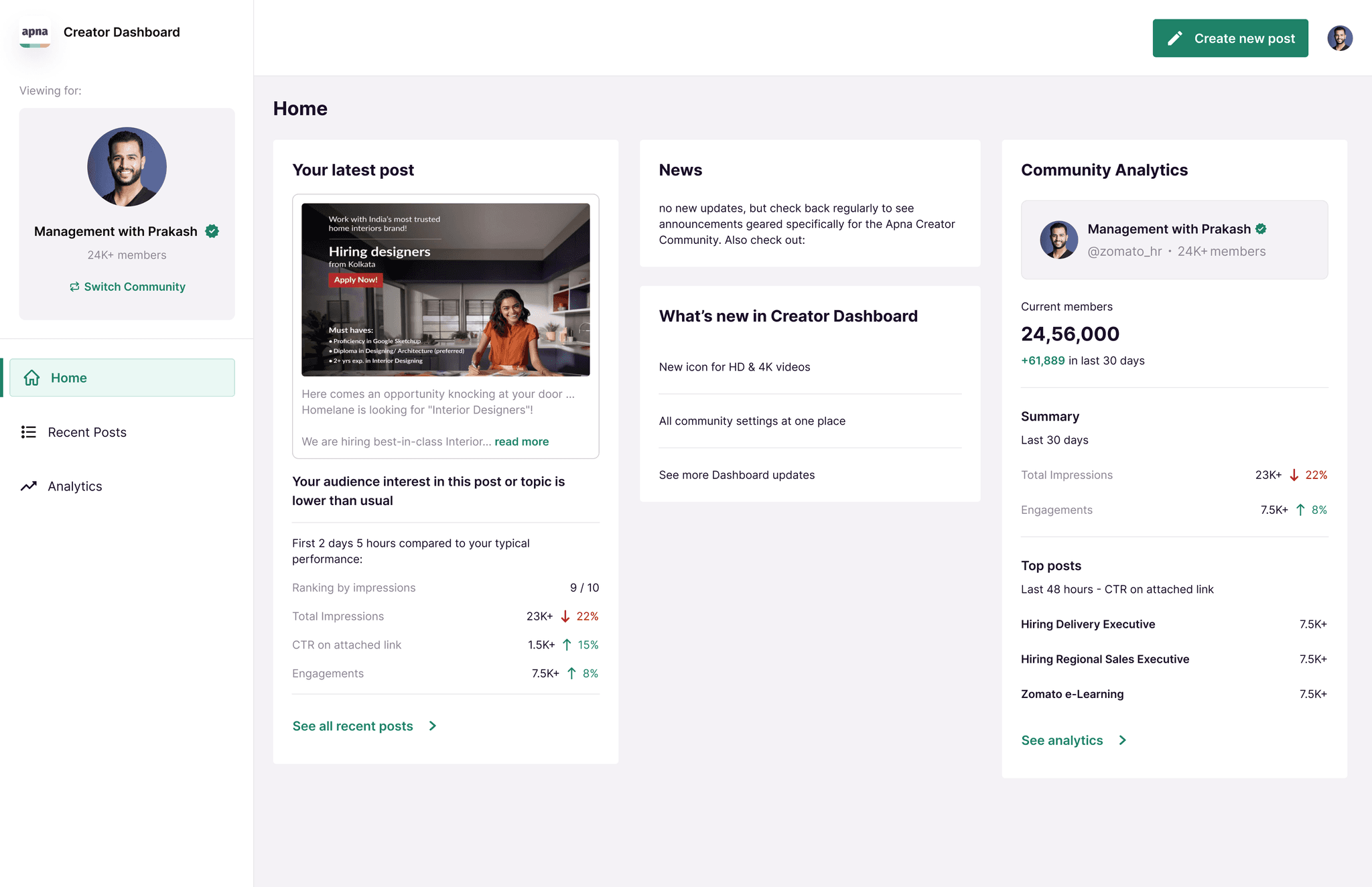
Designing a desktop-first dashboard for the content creators to manage their daily content mgmt activites:
Visibility to their current posts
Easy way to track their analytics
Updates from their groups, if any
Easy way to create new posts
Duration:
1 month
We took some time to understand how the current content creation flow & how a creator reacts to them.
Based on our findings we laid down some principles/ core points for our design & the Information Architecture. The IA was based on 3 core points - Scalability, Findability and task success, Simplicity.
Scalability:
Even if more features are added, the design is scalable enough to support it.
Task Success:
The design should not confuse the user. Ensuring 1 main action per screen.
Simplicity:
Allowing users to consume information seamlessly. Quick & Easy.
Home screen with cumulative summary

Home screen with infinite feed
We created 2 concept explorations for the product positioning approach - An infinite scroll of users' posts or a cumulative summary of overall insights. It took us significant time to get along a decision & decide the product's overall layout.
But we went ahead with the 2nd one, because we realised:
Infinite scroll for seeing ones self posts is irrelevant; had it been a common feed with posts from other users as well, it would have made sense.
Metrics (views, likes etc.) was an important factor, it needs to be shown upfront.
Creators are not consumers, they needed a control the very 1st moment they came, unless they need to figure out different buttons for different triggers
There were 2 primary challenges for this phase that we solved in this phase:
Challenge 1: Building scalable components using our existing Design System
This was done to ensure we maintain Brand Coherence & also save time.

Challenge 2: Covering all the user flows
Based on our IA, there were 3 typical user flows for a creator - new post creation, viewing analytics & engaging with comments. Thus, the 2nd objective was to ensure an easy navigation + interconnectivity b/w possible user flows


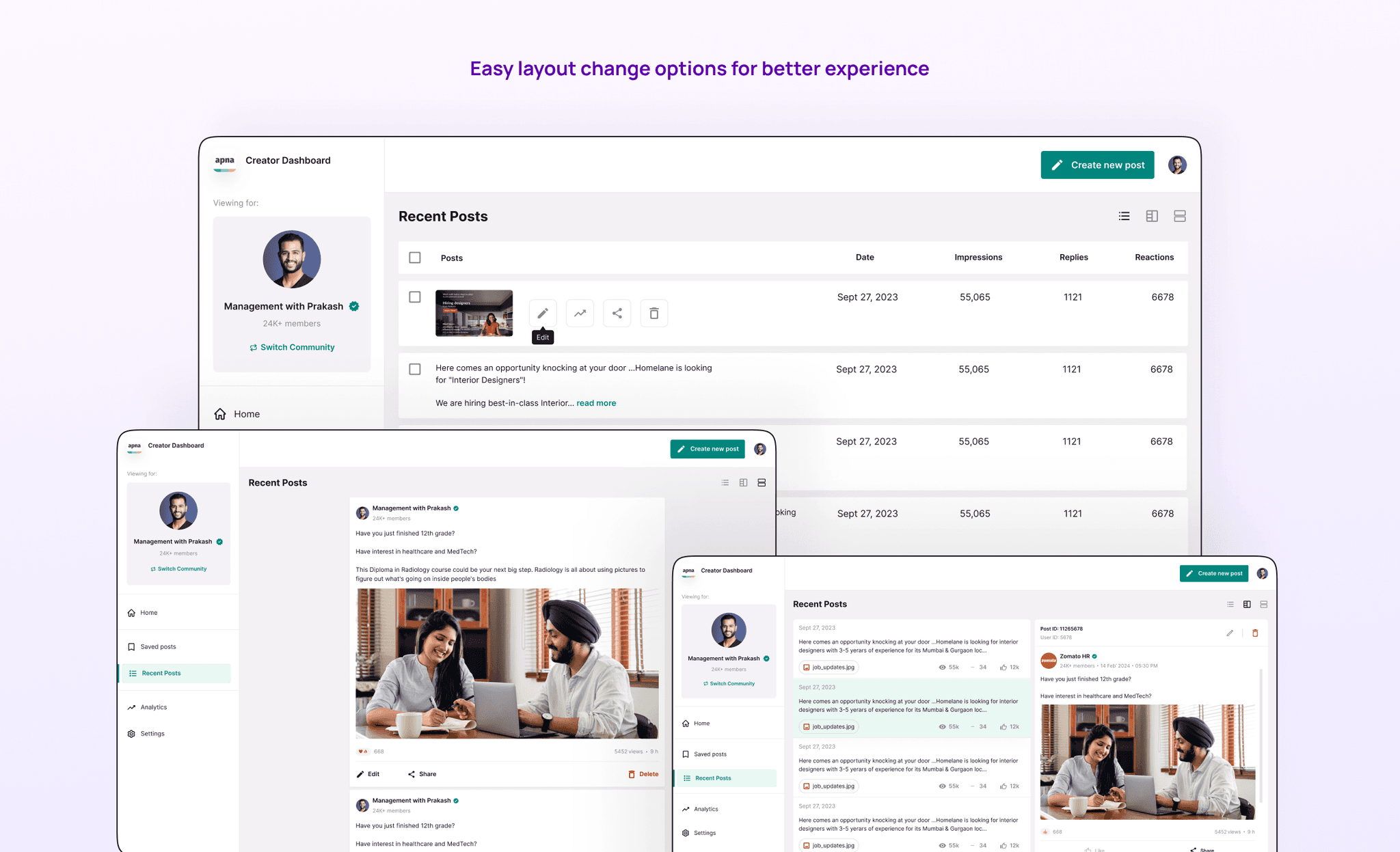
Glimpses from the Creator's platform:


Phase 2
Objective:
Designing a mobile-first dashboard for power creators, that could be accessed from the Apna app itself, to accomplish following use cases:
Supervising posts by other members if they pass community guidelines.
Managing the overall group content strategy - live sessions, themes, weekly events etc.
Easy interconnectivity between different groups they were managing.
Duration:
1 month
Phase 2 was fairly easier. The phase 1 had already set the tone for the overall project. We just had to migrate the almost similar design for the mobile versions with extended features.
The user flow for a Power User was similar to what we did for the Creators, except for the ingress point of the dashboard that was to be integrated from the Apna app.